Creating websites with Statify
This manual explains how to author, build, preview, and publish the source files that Statify turns into a static website. For the product overview, requirements, installation, and first quick start, see Statify.
Statify supports two complementary page formats:
- Markdown pages for documentation, articles, policies, and other text-first content;
- JSON pages for landing pages and structured layouts such as cards, FAQs, how-to guides, and product lists.
A single site may use both formats. The selected template provides the metadata, browser application, styles, and examples needed by the renderer.
Start with a template
Create a site from the template closest to the intended result:
statify init my-site documentation
statify init my-site landing
statify init my-site product
statify init my-site site
Use documentation for a Markdown-first manual, landing or product for a compact JSON
landing page, and site for an advanced example showcasing most features.
Enter the new project. With Statify installed globally, the bundled scripts work without installing an additional preview-server dependency:
cd my-site
Use the template's npm scripts for normal authoring:
| Command | Purpose |
|---|---|
npm start |
Build the complete site and start the local preview. |
npm run build |
Build the complete site without opening it. |
npm run preview |
Preview the most recent build. |
These scripts keep the workflow consistent for contributors and CI. They use
the global Statify installation by default. Projects that need a pinned tool
version can add @nebularstreams/statify as a development dependency; npm
scripts automatically prefer the project-local executable. The lower-level
commands remain available for custom scripts and focused operations.
The templates contain fictional organizations, placeholder legal text, example URLs, and demonstration media. Replace those values before publishing.
Source layout and output mapping
A typical Statify source site looks like this:
site/
  package.json
  metadata.json
  images.json
  pages/
    index.md or index.json
    guide/
      index.md
      installation.md
    res/
      diagram.webp
  assets/
    app/
      website.css
      website.min.js
      webfonts/
    res/
      custom.css
      logo.svg
On build, Statify walks the folder pages/ recursively and applies
these rules:
Source                              Output
pages/index.md                      .build/index.html
pages/index.json                    .build/index.html
pages/guide/installation.md         .build/guide/installation.html
pages/res/diagram.webp              .build/res/diagram.webp
assets/res/custom.css               .build/res/custom.css
assets/app/website.min.js           .build/app/website.min.js
- Markdown and JSON files beneath
pages/become HTML. - Other page files are copied unchanged.
- Everything inside
assets/is copied into the output root. Bothpages/res/andassets/res/therefore produceres/...URLs. Usepages/res/for page-owned resources andassets/res/for shared logos, styles, images, and media. Other folder structures are also supported.
Configure site-wide metadata
Begin with the selected template's metadata.json. The renderer expects its
established structure, so editing a known template is safer than creating the
file from scratch.
Update at least:
- the site
titleanddescription; - for a normal deployment, the canonical URL and social sharing image;
- the
sitesection; authorandpublisher;fontsused by the page, for example["Roboto", "Open Sans"];- the
headsection for site-wide icons, stylesheets, or scripts; - navigation and breadcrumb URLs.
For a normal deployment, set the website's final public URL once in the root
canonical field, including any deployment subpath. Other site-local URLs may
begin with / or be relative to the current page; Statify resolves them for
their context. Portable builds ignore the canonical URL.
The canonical URL is the only full site URL that needs to be declared. Its
origin identifies the public domain, while its pathname identifies the site
root. Do not repeat either value in site.domain, site.url, or
site.relativeRoot; these fields are not part of the current URL contract.
The social sharing image accepts url and alt, plus optional intrinsic
width and height. Statify calculates the dimensions of local image files
and adds them to the Open Graph metadata automatically. Remote images are not
downloaded during a build, so provide their dimensions explicitly when needed:
{
  "image": {
    "url": "https://example.com/social-card.jpg",
    "alt": "A descriptive social preview",
    "width": 1200,
    "height": 630
  }
}
The section site
The section site contains site-wide definitions and features.
"site": {
  "name": "My Company Site",
  "cookies": {
    "disabled": false,
    "functional": true,
    "thirdparty": true,
    "analytics":"xxxxxxxxxx",
    "policyUrl": "/docs/cookies.html"
  },
  "skin": "dark"
}
Important fields:
site.namecontains the public site name.site.forceAbsoluteLinksoptionally converts authored local URLs to absolute public URLs. It defaults tofalse; leave it unset for ordinary relative output. Canonical, Open Graph, breadcrumb, and structured-data URLs are made absolute independently when required.site.portablecreates a relocatable build for local development, ZIP distribution, or hosts where the final URL path is unknown. Portable mode ignorescanonicalandsite.forceAbsoluteLinkswhile it is enabled. A portable site does not need to declare a canonical URL.site.cookiescontrols the consent dialog and cookie-dependent services such as YouTube™️ videos and Google Analytics™️.site.skinoptionally fixes the site todarkorlight. If omitted, the navigation bar displays a skin toggle.
Cookies object
The cookies object declares the categories used by the site and determines
the consent dialog shown to visitors.
functionaldeclares functional browser storage.thirdpartydeclares third-party services that may store cookies.analyticsprovides the Google Analytics ID and enables analytics consent.disabledsuppresses the consent dialog. In that case,analyticsandthirdpartycontrol automatic service activation.
Head resources
Define site-wide resources in head. The t property selects the HTML element
(link, script, and so on); remaining properties become its attributes:
{
  "t": "link",
  "rel": "stylesheet",
  "href": "/app/website.css"
}
The same convention is used for icons, custom stylesheets, browser scripts,
and other resources already demonstrated by the templates. Shared head
resources should normally begin with / so they resolve from
the site root derived from metadata.canonical on every generated page.
URL and path resolution
For normal builds, metadata.canonical is the single absolute URL for the
website and determines its deployment pathname. Other URLs may begin with /
to resolve from that site root, or remain relative to the current generated
page:
{
  "canonical": "https://example.com/games/vanta-bloom/",
  "site": {
    "name": "Vanta Bloom"
  }
}
With this configuration, /app/website.css resolves beneath
/games/vanta-bloom/; there is no separate domain or relative-root setting to
keep synchronized.
| Authored value | Resolution |
|---|---|
image.jpg |
Relative to the current generated page |
../image.jpg |
Relative to the parent directory |
/res/image.jpg |
Relative to the canonical site root |
#section |
Fragment in the current document |
https://example.com/resource |
Unchanged absolute or external URL |
Use leading-slash paths for shared scripts, stylesheets, logos, navigation destinations, and other resources that must work from pages at arbitrary depths. Use an ordinary relative path only when it should genuinely resolve from the current page.
Set site.forceAbsoluteLinks to true only when authored local URLs must be
emitted as absolute public URLs. It does not alter external URLs, fragments,
email links, or telephone links. This replaces the old relativeLinks
setting: relative output is now the default, so most sites should omit both
fields.
Canonical, Open Graph, breadcrumb, and structured-data URLs are emitted as
absolute URLs. By default, Statify derives a page canonical from the root
canonical and its generated route. An explicit absolute canonical in
page metadata overrides that derived URL.
Portable builds
Set site.portable to true when the generated folder must work without a
known public origin or deployment subpath:
{
  "site": {
    "name": "My Portable Site",
    "portable": true
  }
}
This is useful for local development, downloadable ZIP packages, itch.io HTML
uploads, and similar environments. Ordinary relative URLs remain page-relative,
while /... paths resolve from the generated site root. The production
canonical may remain in metadata.json, but it and
site.forceAbsoluteLinks have no effect in portable mode.
Statify calculates the portable root separately for each generated page. For
example, /app/website.css may become ./app/website.css on index.html and
../../app/website.css on a page two directories deep. Follow the normal URL
contract when authoring; do not add ../ prefixes merely to compensate for
the final page depth.
A portable build has no authoritative public URL. Statify therefore omits canonical links, Open Graph metadata, structured-data snippets, breadcrumb structured data, and the generated web-app manifest. Disable portable mode for the production build that should be indexed and produce social previews.
Navigation
The navigation bar is defined in the navibar section:
"navibar": {
    "home": "/",
    "logo": "/web/res/logo-navibar.png",
    "displayTitle": true,
    "links": {
        "documents": {
          "icon": "file-alt",
          "class": "inter bread",
          "url": "/index.html"
        }
    }
}
homeandlogodefines the link and the small logo displayed at the leftmost place in the navigation bar.- Primary navigation entries live in
navibar.links. A separator or flexible spacer is represented by: displayTitledisplays the page title after the navibar links
{
  "SPACER": {
    "separator": true
  }
}
Keep navigation routes consistent with the generated HTML paths. Verify every navigation target after building the complete site.
Web app manifest
The optional webmanifest section creates a manifest that lets supported
desktop and mobile browsers install the website as an application. Only
icon and iconType are required.
"webmanifest": {
    "icon": "/res/logos/logo.png",
    "iconType": "image/png",
    "background_color": "#000000",
    "theme_color": "#000000"
  }
Creating Documentation pages
Markdown is the preferred page format for documentation and long-form text.
Place .md files anywhere beneath pages/; directories become matching URL
directories.
Example:
pages/
  index.md
  guide/
    index.md
    installation.md
    configuration.md
  reference/
    commands.md
Statify Markdown supports ordinary tokens: images, tables, task lists, fenced code, and headings, plus image carousels and embedded YouTube™️ videos.
- A first-level heading defines the page title.
- Second- and third-level headings also appear in the page index.
Documentation links
Links may be relative to the source page or absolute.
[Installation](guide/installation.md)
[Configuration](configuration.md)
For an image stored beside page resources:

After reorganizing folders, check both links and image paths in the generated site.
Hosted videos, YouTube™️ embeds, and image carousels
Statify markdown extensions support richer media directly in the document.
Embedding YouTube™️ videos in documents
Insert a YouTube video by placing @yt- immediately before its video ID:
@yt-<VIDEO_ID>
For example, combine the prefix @yt- with the video ID YECe-5fc5bU. Use a
real video ID supplied by the content owner or verified from its source, and do
not publish third-party material without the appropriate rights.
Embedding hosted videos in documents
Markdown documents also support HTML, so you can embed a hosted video directly:
<video width="1920" height="1080" poster="res/my-video-poster.webp" autoplay muted controls loop >
  <source src="res/my-video.mp4">
</video>
Image Carousels in documents
Create an image carousel with ordinary image elements inside a .item-image-carousel:
<div class="item-image-carousel">
    <img class="fadein" src="res/carousel/image-1.webp">
    <img class="fadein" src="res/carousel/image-2.webp">
    <img class="fadein" src="res/carousel/image-3.webp">
</div>
The fadein class applies the expected carousel transition. Confirm that each
image exists at its final output URL and uses suitable dimensions. When an
image conveys important information, provide equivalent explanatory text near
the carousel.
You may use classes defined in custom.css or another linked stylesheet.
Notice boxes
Add notice boxes with the md-notice HTML token. A Font Awesome class adds an icon.
<md-notice class="fa-exclamation-triangle" markdown="1">
Without consent for third-party services, embedded third-party media remains unavailable.
</md-notice>
Result:
Responsive row layouts
Create responsive rows of text or videos with the md-flex HTML token.
<md-flex markdown=1>
 @yt-<VIDEO-1>
 @yt-<VIDEO-2>
 @yt-<VIDEO-3>
</md-flex>
Documentation breadcrumbs
Add breadcrumbs in an HTML comment at the end of a Markdown page. List one
breadcrumb per line in hierarchical order as link,title. If the title is
omitted, Statify derives it from the link.
 <!-- Breadcrumbs
 /tools/,Tools
 -->
The first breadcrumb becomes the title-bar back link. The full trail appears after the page-index links in the navigation panel.
Legal and policy examples
The documentation template includes example policy pages. Replace their organization, jurisdiction, dates, practices, storage keys, and contact details. They are structural examples, not legal advice or reviewed policies.
Decorative images for documents
On sufficiently wide screens, Markdown pages display a random right-panel image
from images.json. The file accepts an Unsplash collection response or your
own image list. Preserve attribution and confirm that you have permission to
publish every third-party image.
Creating landing pages
Landing pages are JSON pages rendered by the FeatureList widget. The
landing, product, and site templates demonstrate this page type.

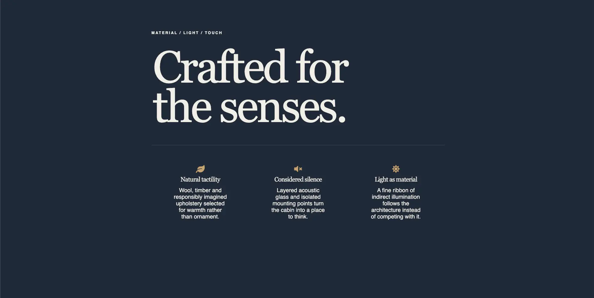
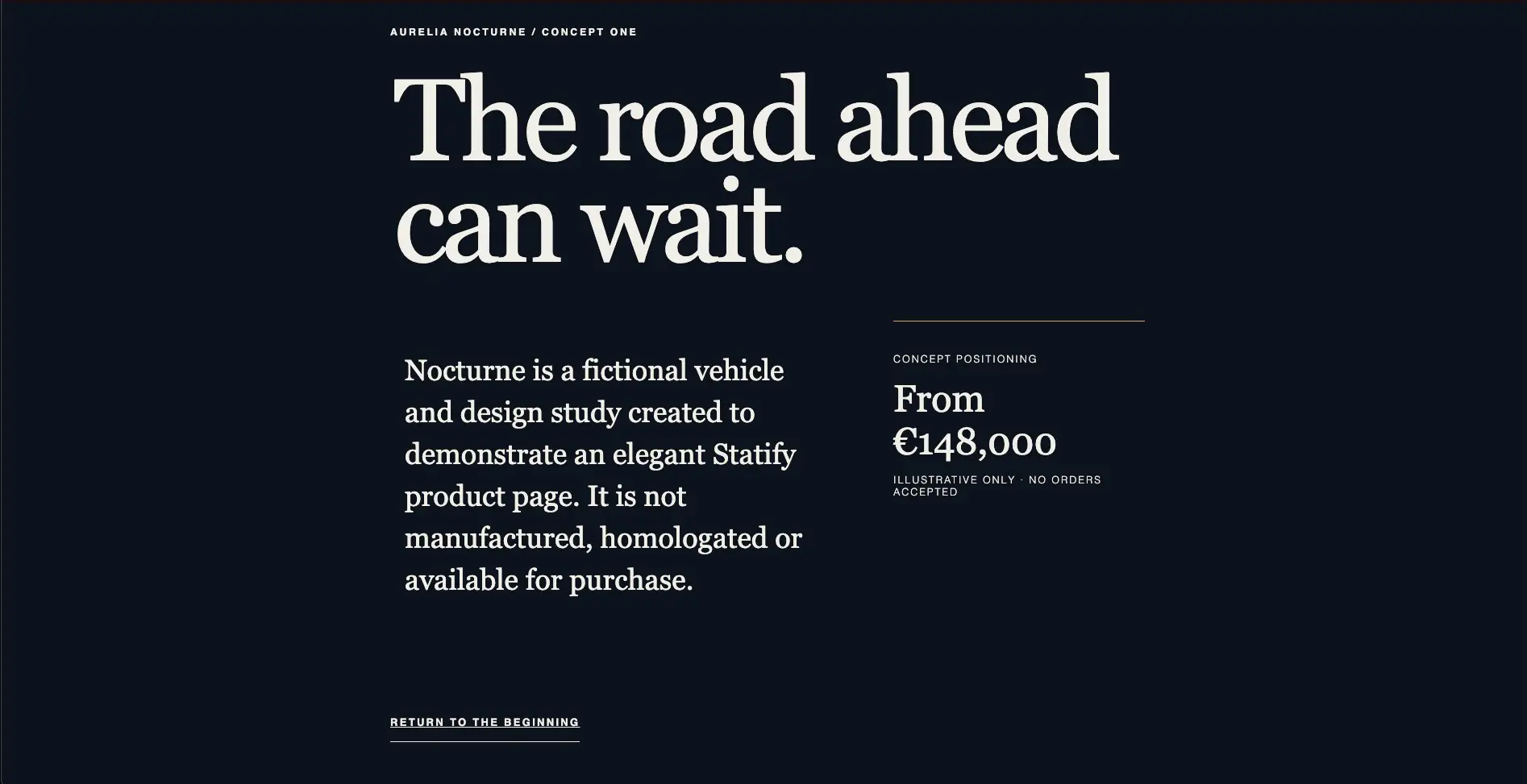
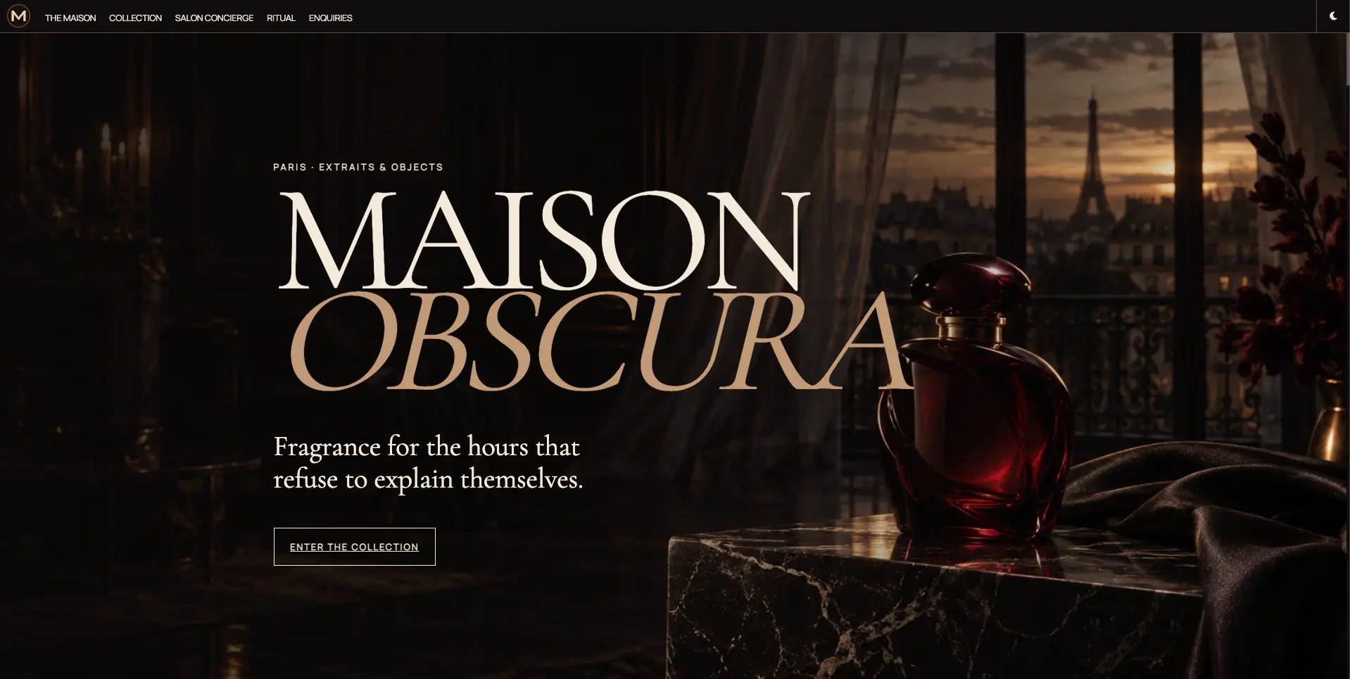
The FeatureList widget defines a set of Features, each of them can contain a main video block, a main title block, several item blocks inside the items array, and several card blocks inside the cards array:
{
  "widget": "FeatureList",
  "title": "Company name",
  "options": {"autoHideToolbar": true, "disableToolbar": false},
  "features": {
    "youtube": {},
    "video": {},
    "title": {
      "items": [
        {},
        {},
        {}
      ]
    },
    "cards": [
      {
        "icon": "broadcast-tower",
        "iconClass": "icon-outline",
        "subclass": "text-al-center pad-4",
        "title": "Delicious Pages",
        "text": "Our company creates delicious pages for your pleasure",
        "items": [
          {},
          {},
          {}
        ]
      },
      {
        "icon": "star",
        "iconClass": "icon-outline",
        "subclass": "text-al-center pad-4",
        "title": "Delicious Cards",
        "text": "Our company creates delicious cards for your pleasure",
        "items": [
          {},
          {},
          {}
        ]
      }
    ]
  },
  "footer": {
    "links": []
  }
}
Use the exact property names and nesting demonstrated by a template. CSS class strings are presentation hooks provided by the browser application and local stylesheet; reuse known classes instead of inventing behavior that the selected stub does not provide.
Main Title
The optional main title is the first block in the features object, ideally containing the main logo and a motto. The following example title block contains a full screen image, a company logo and the company motto:
"features": {
  "title": {
      "containerClass": "fullrow relative",
      "background": "url(images/promo-background.webp)",
      "items": [
        {
          "el": "h1",
          "text": "Example Company Website",
          "class": "text-al-center"
        },
        {
          "el": "h2",
          "text": "Awesome landing page for a generic example company",
          "class": "text-al-center"
        },
        {
          "image": "images/logo.png",
          "class": "col-4 to-bottom absolute",
          "imageClass": "w-100 h-100",
          "alt": "Example Company Logo",
          "el": "div",
          "link": "https://example.com"
        }
      ]
  }
}
Main video and main YouTube™️ video
The optional main video appears before the title and fills its section.
titleis the hover text and accessibility labelurlis an absolute or relative URL to a browser-supported video file, not a video-service page.- Optional
imageis the poster displayed while the video loads. - Optional
mutedstarts playback muted. Autoplaying video is always muted. - Optional
nocontrolshides the video controls.
{
  "features": {
    "video": {
      "url": "videos/main-video.mp4",
      "image": "videos/main-video.webp",
      "title": "Example corporate video as a title",
      "autoplay": true,
      "muted": true,
      "loop": true
    }
  }
}
You may use YouTube™️ instead, but it requires third-party consent and usually loads more slowly than a hosted video.
{
  "features": {
    "youtube": {
      "ref": "VIDEO_ID",
      "image": "res/video-poster.webp",
      "title": "Descriptive video title"
    }
  }
}
Cards
The cards block renders sub-features in responsive rows. Each card may include
an icon, title, description, and an items array containing media or other
content items.
Keep nesting shallow unless the demonstrated layout genuinely requires another level. A small number of clear sections is easier to read and maintain than reproducing every pattern from the rich reference.
Content Items
Content items can be used in the title block, and in the items array of feature and card blocks.
Text and headings
A text item may define an element, text, and presentation classes:
{
  "el": "h2",
  "text": "A useful heading",
  "class": "accent"
}
Choose elements semantically. Keep one primary page heading and use lower-level headings in order.
Images
An image item supplies a site URL, alternative text, and optional classes:
{
  "image": "res/product.webp",
  "alt": "The product dashboard showing weekly activity",
  "class": "shot col-12"
}
Always provide useful alt text unless the image is purely decorative. Verify
that the source file maps to the same output URL—for example,
assets/res/product.webp produces /res/product.webp.
Image carousels
imageCarousel accepts an array of objects with url values:
{
  "imageCarousel": [
    {"url": "res/gallery/one.webp"},
    {"url": "res/gallery/two.webp"},
    {"url": "res/gallery/three.webp"}
  ]
}
Keep image dimensions and aspect ratios reasonably consistent to reduce layout movement. Provide contextual text outside the carousel when the images convey important information.
MP4 videos
A video item displays a local or remote video with options such as muted
and autoplay.
{
  "video": {
    "url": "res/videos/showcase.mp4",
    "image": "res/videos/showcase.webp",
    "title": "Product showcase",
    "autoplay": true,
    "muted": true,
    "loop": true
  }
}
urlis a relative or absolute video URL.- Optional
imageis the poster displayed while the video loads. - Optional
autoplaystarts playback automatically. - Optional
mutedstarts playback muted. Autoplaying video is always muted. - Optional
nocontrolshides the video controls. titleis the hover text and accessibility label.
Embedded YouTube™️ Video
A youtube item embeds a YouTube™️ video, if cookies have been accepted. If not, the poster image is shown.
{
  "youtube": {
    "ref": "VIDEO_ID",
    "image": "res/video-poster.webp",
    "title": "Descriptive video title",
    "class": "smallervideo"
  }
}
- Use a real video ID supplied by the content owner or verified from its source. Provide a local poster image and a descriptive title. Do not invent video IDs or publish third-party material without the appropriate rights.
- If
imageis not supplied, the YouTube™️ thumbnail will be shown instead.
Links and calls to action
A link item is represented by a nested link object:
{
  "link": {
    "text": "Get started",
      "href": "/docs/start.html",
    "class": "accentbutton"
  }
}
Use descriptive link text and real destinations. Distinguish deliberate external links from site-relative paths.
Creating catalogues with list pages
List pages load one or more JSON collections in the browser and render their
items as responsive, selectable cards. They are independent pages (not nested
inside a FeatureList page)
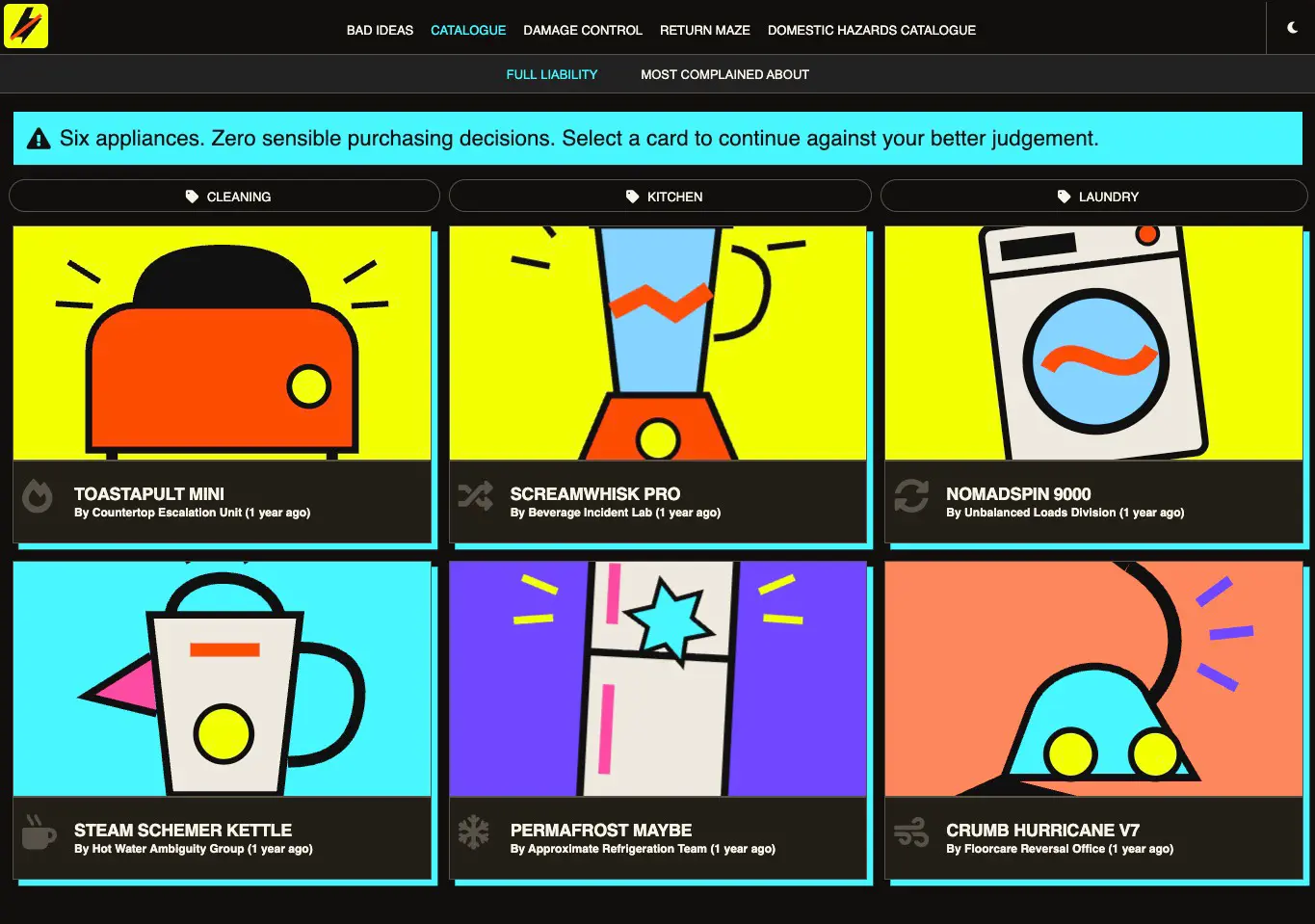
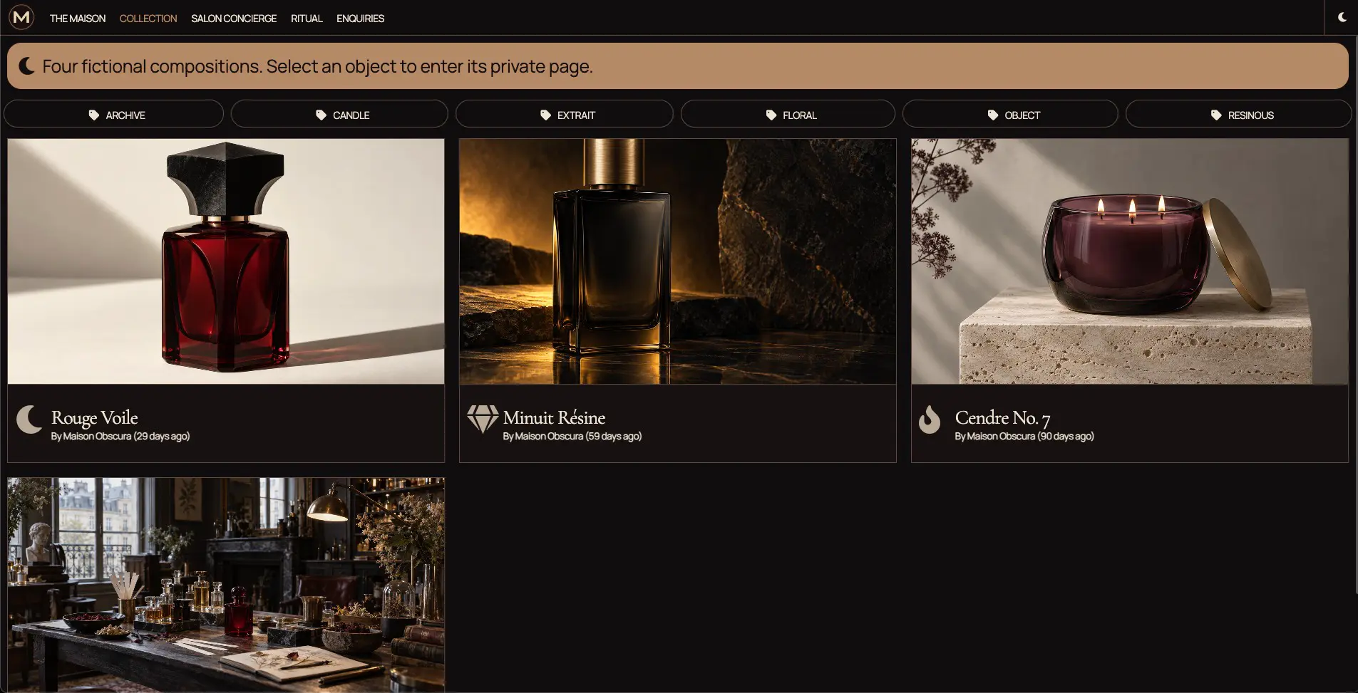
- These pages use the top-level
Clientwidget to instantiate aListWidget. - The
ListWidgetis defined in thesiteapplication stub. For a site created without that template, generate the list application stub in the site's application assets:
statify app list assets/app/
A typical local list page uses this source layout:
site/
  pages/
    catalogue.json
  assets/
    lists/
      products.json
      featured.json
    res/
      products/
        product-one.webp
The JSON page selects the client widget and defines the available collections
inside client.attrs.lists. Each collection key becomes an internal list ID,
while its label is displayed in the list selector. The first collection is
shown initially.
{
  "title": "Product catalogue",
  "description": "Browse the complete catalogue or view featured products.",
  "widget": "Client",
  "class": "catalogue bg-window-lo",
  "generateH1": true,
  "client": {
    "widget": "ListWidget",
    "attrs": {
      "featureClass": "col-12 col-md-6 col-xl-4",
      "imageClass": "catalogue-image",
      "innerClass": "catalogue-card",
      "titleClass": "catalogue-title",
      "lists": {
        "all": {
          "url": "/lists/products.json",
          "label": "All products",
          "icon": "th-large",
          "notice": {
            "icon": "lightbulb",
            "text": "Select a product to open its detail page."
          }
        },
        "featured": {
          "url": "/lists/featured.json",
          "label": "Featured",
          "icon": "star"
        }
      }
    }
  }
}
featureClass controls the responsive card grid. imageClass, innerClass,
and titleClass provide hooks for the site stylesheet. These classes already have sensible
default values and don't need to be provided if you are happy with the default rendering.
A collection's optional notice is rendered once, in a full-width row above its cards.
Native list data
Every list URL must return an object containing an items array. Local list
files placed below assets/lists/ are copied to the generated /lists/
directory, allowing the page to use site-root URLs such as
/lists/products.json.
{
  "items": [
    {
      "id": "product-one",
      "title": "Product One",
      "description": "A concise product description, that also allows Markdown notation",
      "image": "/res/products/product-one.webp",
      "tags": "kitchen featured",
      "owner": "Example Company",
      "creationTime": 1757465600000,
      "icon": "box-open",
      "detailsUrl": "/products/product-one.html",
      "features": {
        "Price": "149€",
        "Dimensions": "149 × 39 mm",
        "Warranty": "2 years"
      }
    }
  ]
}
The normalized item fields are:
| Field | Purpose |
|---|---|
id |
Stable card identifier. A real ID is preferable even though the widget can generate a temporary one. |
title |
Card title. |
description |
Optional description displayed on the detail page. Supports Markdown. |
image |
Image URL or relative asset path. |
ytref |
YouTube™️ video ID displayed instead of the image on the item detail page. |
tags |
Space-separated categories used to generate the visible filters. |
owner |
Optional creator or publisher shown in the card footer. |
ownerImage |
Optional creator avatar URL or relative asset path. |
creationTime |
Optional Unix timestamp in milliseconds, used for sorting and relative age. |
icon |
Optional Font Awesome identifier without the fa- prefix. |
detailsUrl |
Optional destination opened when the card is selected. Prefer relative URLs for internal pages. |
features |
Optional display label/value object rendered as a table on a maximized item detail page. |
Mapping non-native data
If the fetched items already use the normalized fields, omit fields. For a
different source schema, add a fields tokenizer to that collection. Tokens
use $key$; slash-separated paths read nested values, and tokens can be mixed
with literal text:
{
  "url": "/lists/backend-products.json",
  "label": "Products",
  "fields": {
    "id": "$sku$",
    "title": "$meta/name$",
    "description": "$meta/summary$",
    "image": "/res/products/$sku$.webp",
    "tags": "$category$",
    "owner": "Example Company",
    "creationTime": "$publishedAt$",
    "detailsUrl": "/products/$slug$.html",
    "icon": "box-open",
    "features": {
      "Price": "$pricing/display$",
      "Dimensions": "$specifications/dimensions$",
      "Hazards": "$safety/hazards$"
    }
  },
  "image": "/res/products/default.webp"
}
Literal strings are copied to every normalized item. An empty mapping produces
an empty value; it does not copy the same-named source field automatically.
List-level image and icon values act as card fallbacks and may themselves
contain tokens. Repeated identical media can therefore be intentional, but it
can also indicate an empty or incorrect tokenizer mapping.
The keys inside features are free-form display labels. The maximized
ListItem renders the resolved values as rows in a feature table and omits
features without a value.
Features are not displayed by the compact cards in the list grid.
Publishing one static page per item
A collection can optionally generate an indexable HTML detail page for every item.
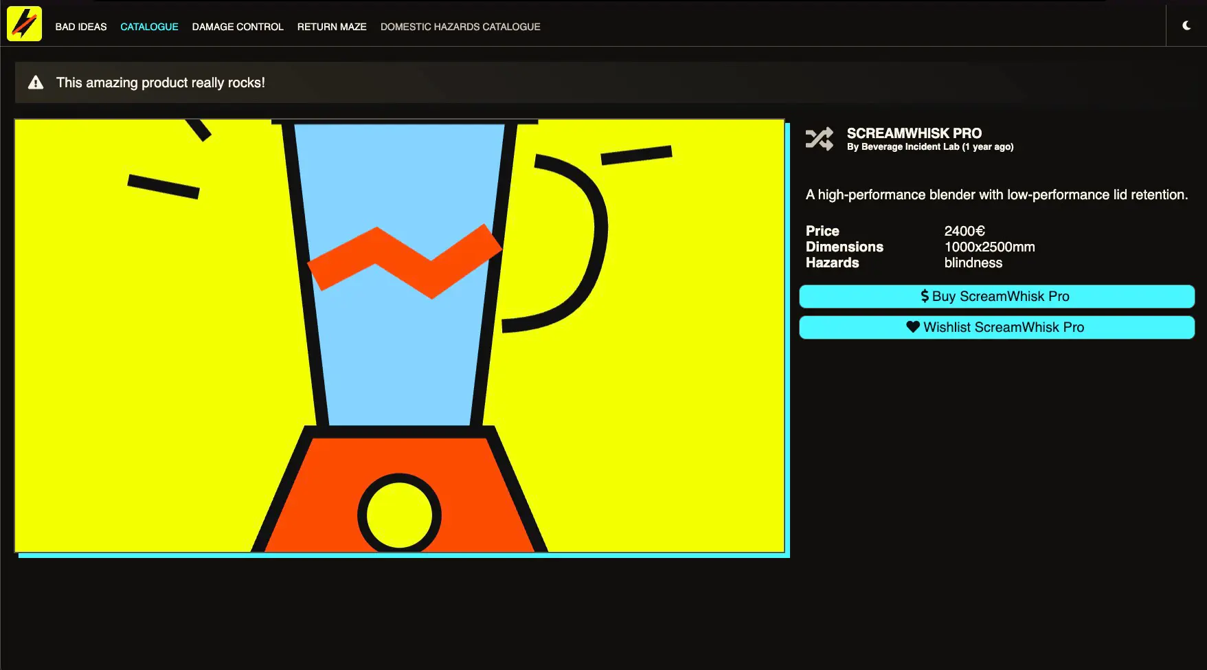
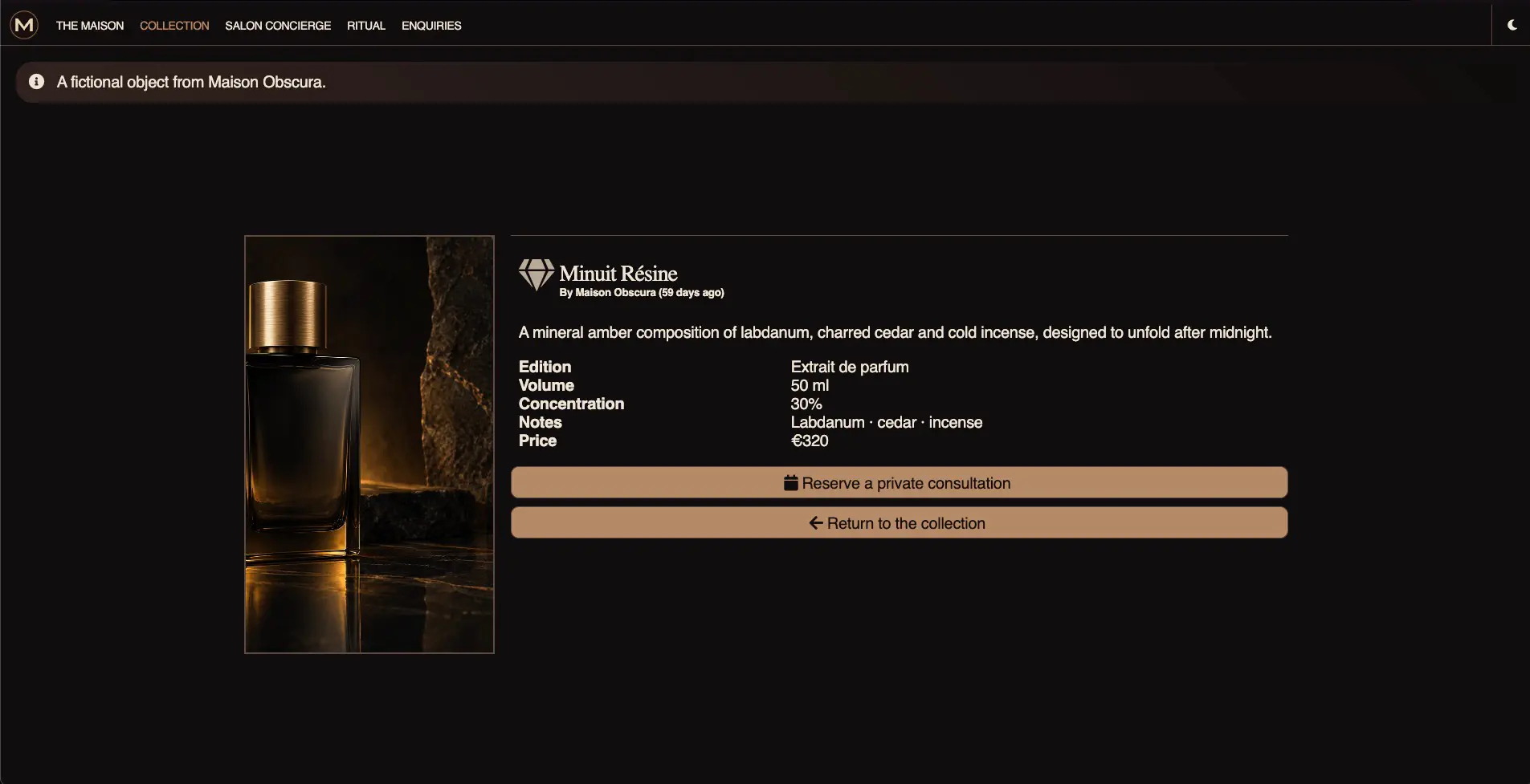
To enable this functionality, add a publish section to the list definition:
{
  "url": "/lists/products.json",
  "label": "All products",
  "publish": {
    "out": "products/$item/id$.html",
    "page": {
      "widget": "ListItem",
      "notice": {
        "icon": "info-circle",
        "text": "Product details"
      },
      "actions": {
        "buy": {
          "text": "Buy $item/title$",
          "icon": "shopping-cart",
          "url": "/checkout.html?productId=$item/id$"
        },
        "wishlist": {
          "text": "Add $item/title$ to wishlist",
          "icon": "heart",
          "url": "/wishlist.html?productId=$item/id$"
        }
      },
      "snippet": {
        "@context": "https://schema.org",
        "@type": "Product",
        "name": "$item/title$",
        "description": "$item/description$",
        "image": "$item/image$"
      },
      "ogtype": "product",
      "meta": [
        { "property": "product:price:amount", "content": "$item/features/price"},
        { "property": "product:price:currency", "content": "EUR"}
      ]
    }
  }
}
publish.out is the exact relative output filename Statify writes, including
the extension you choose. It must not be absolute or contain ... When an item
has no explicit detailsUrl, the browser widget also uses this expression as
the card destination.
The publisher applies optional fields before rendering. The available publication
tokens are:
| Token scope | Value |
|---|---|
$item/...$ |
The normalized item after applying fields. |
$metadata/...$ |
The complete site metadata |
$site/...$ |
The SITE section of the above metadata |
publish.page.widget names the registered server-side widget used for the
detail page. The bundled ListItem widget renders the description, feature
table, actions, and a YouTube™️ embed when the normalized item contains
ytref. The only built-in accepted value is currently ListItem. Other values
require a corresponding custom widget created and registered as described in
Advanced Statify Usage.
publish.page.notice adds a notice message to the detail-page.
Detail-page structured data and Open Graph
All these values are optional.
publish.page.snippet defines structured data and is tokenized for each item.
This lets search engines such as Google understand the published item and may
make it eligible for product or other rich search results.
Use the Schema.org type that matches the content, such
as Product:
 "snippet": {
    "@context": "https://schema.org",
    "@type": "CreativeWork",
    "author": "@$item/owner$",
    "image": "$item/image$",
    "name": "$item/title$"
}
publish.page.ogtype declares the Open Graph type. publish.page.meta adds
related metadata such as article or product properties.
Detail-page actions
publish.page.actions is an optional object of link buttons. Its keys are
identifiers only, and declaration order controls button order. Every action
requires url and at least one of text or icon:
| Field | Purpose |
|---|---|
url |
Link destination. Supports $item/...$ and $metadata/...$ tokens. |
text |
Visible button label. Supports $item/...$ and $metadata/...$ tokens. |
icon |
Optional Font Awesome icon name without the fa- prefix. |
download |
Optional, indicates that the url is a file to download |
Actions are links rather than API requests. Point them at pages or backend routes that perform checkout, wishlisting, booking, or another next step.
Generating the detail pages for every item
Static item publication is a separate build step. Add it to the project's
package.json so contributors do not need to remember a raw command:
{
  "scripts": {
    "build": "npm run build:site && npm run build:items",
    "build:site": "statify folder .",
    "build:items": "statify list ./pages/catalogue.json ./ .build"
  }
}
Then generate the site and its item detail pages with:
npm run build
Arguments can be forwarded to the focused catalogue script while authoring:
npm run build:items -- --list all --item product-one
npm run build:items -- --dry-run
The underlying CLI equivalents are:
statify list pages/catalogue.json .
statify list pages/catalogue.json . .build --list all
statify list pages/catalogue.json . .build --list all --item product-one
statify list pages/catalogue.json . .build --dry-run
Without --list, every collection containing publish is generated. --item
matches the normalized item ID. --dry-run validates publication without
writing files. statify folder does not publish list items automatically.
List URLs may be local site paths or absolute URLs served by a CORS-enabled
backend. Prefer /lists/... for lists distributed with the site.
Before publishing, load every collection and verify its selector label, notice, category filters, card media, footer metadata, fallbacks, and detail links. Confirm that remote list servers permit the deployed origin through CORS, and preview the grid at both desktop and narrow widths. For published item pages, also verify a representative feature table, structured-data snippet, resolved action URLs, output destination, and the configured server widget.
Published item pages follow the same URL rules as every other generated page.
Their directory is determined by publish.out: ordinary relative list, image,
and action paths resolve from that output directory, while paths beginning
with / resolve from the Statify site root. Prefer leading-slash paths for
shared assets and destinations used by both catalogue cards and nested detail
pages. Absolute external URLs remain unchanged.
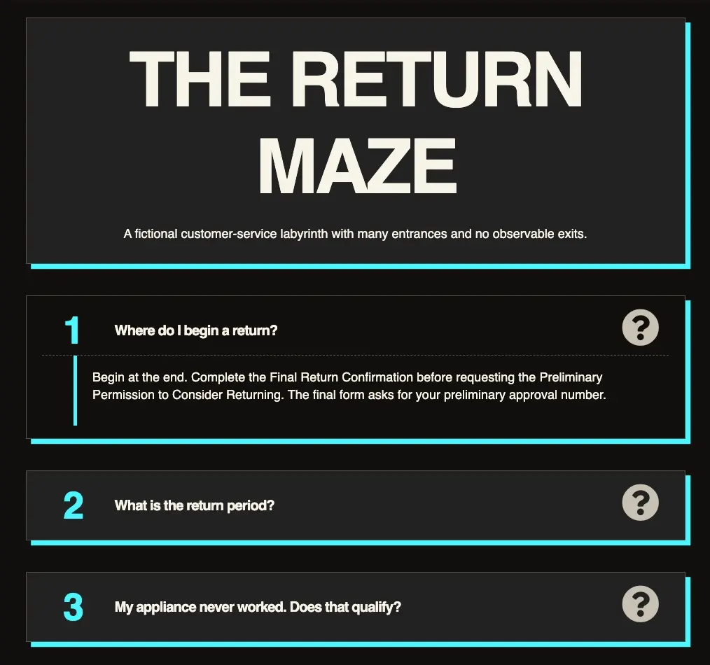
Creating FAQ pages
FAQ pages use the Faq widget.
- Every entry contains a question in
nameand a Markdown-capable answer inacceptedAnswer. Faqis a top-level page widget; do not nest it insideFeatureList.- Normal builds generate matching JSON-LD structured data so search engines such as Google can understand and present the FAQ content in search results.
- FAQs display a random decorative image picked from
images.jsonif the screen is large enough.
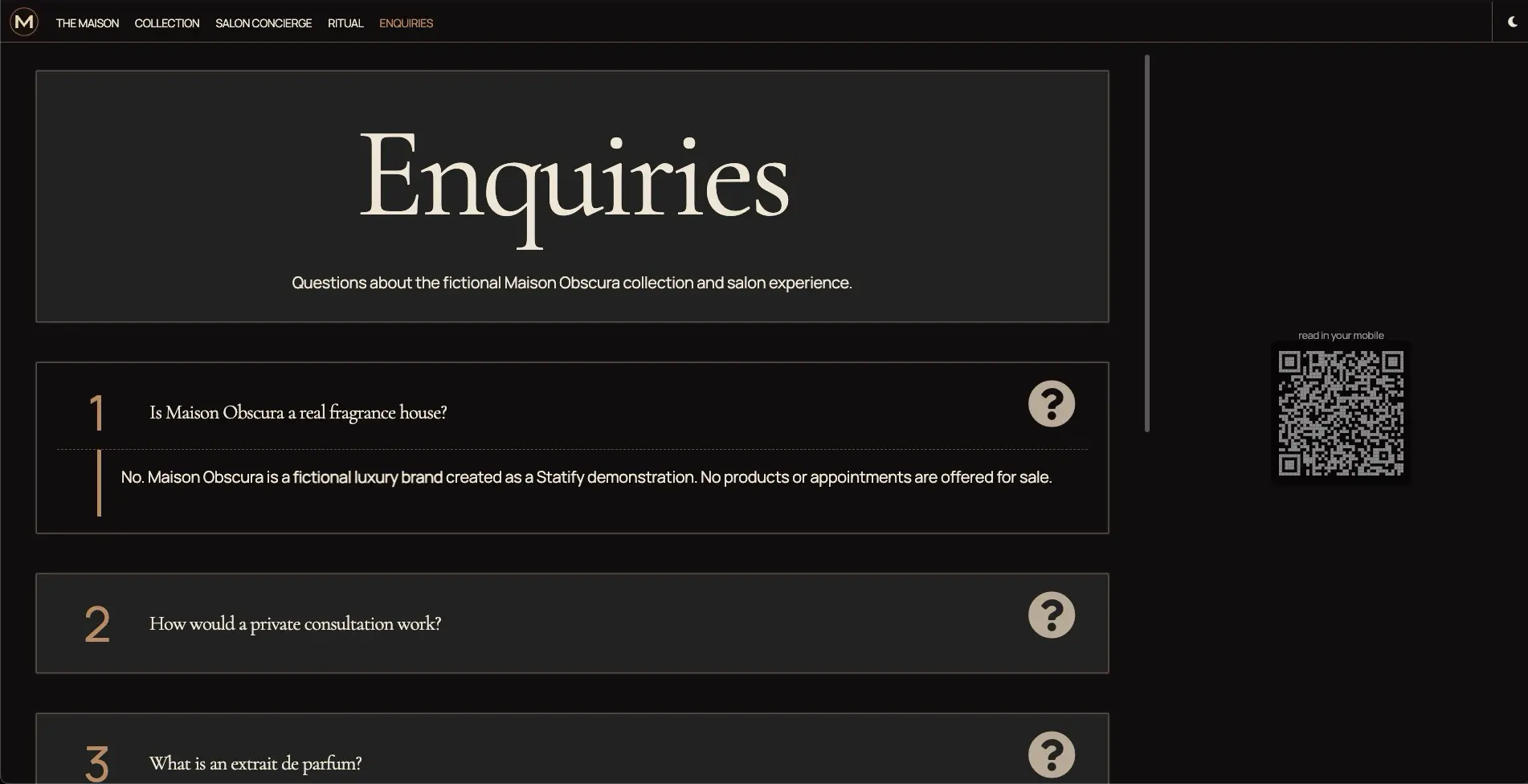
Example: faq.json
{
  "widget": "Faq",
  "title": "Frequently asked questions",
  "faq": {
    "mainEntity": [
      {
        "name": "How do I get started?",
        "acceptedAnswer": "Install the package, initialize a template, and run `npm start`."
      },
      {
        "name": "Where is the generated website?",
        "acceptedAnswer": "The default output directory is **.build/**."
      }
    ]
  }
}
Creating how-to pages
How-to pages use the HowTo widget for step-by-step instructions.
- They support estimated cost, total time, author, publisher, tools, supplies, step images, and YouTube™️ videos.
HowTois a top-level page widget; do not nest it insideFeatureList.- Normal builds generate matching JSON-LD structured data.
- How-to pages display a random decorative image from
images.jsonwhen the screen is large enough.
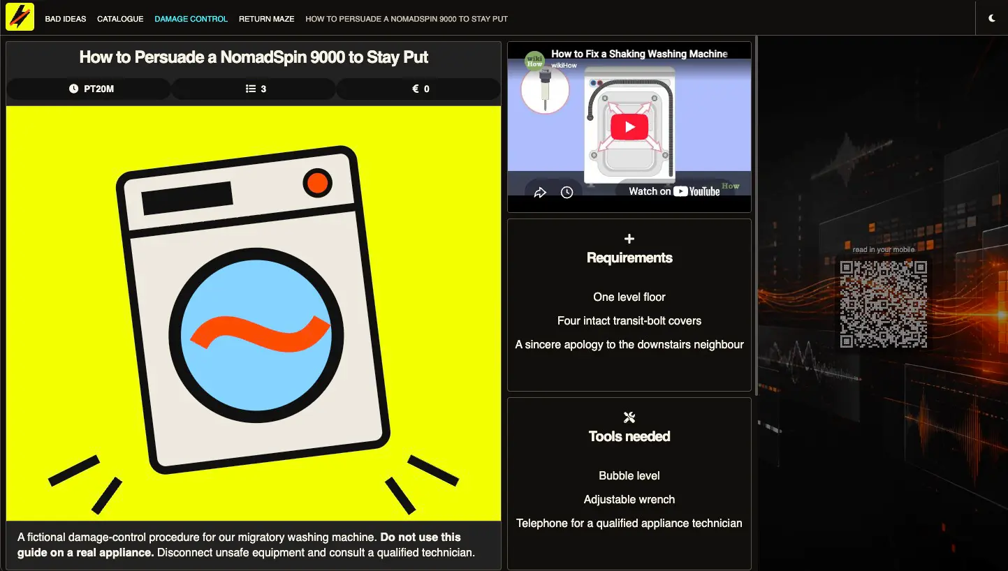
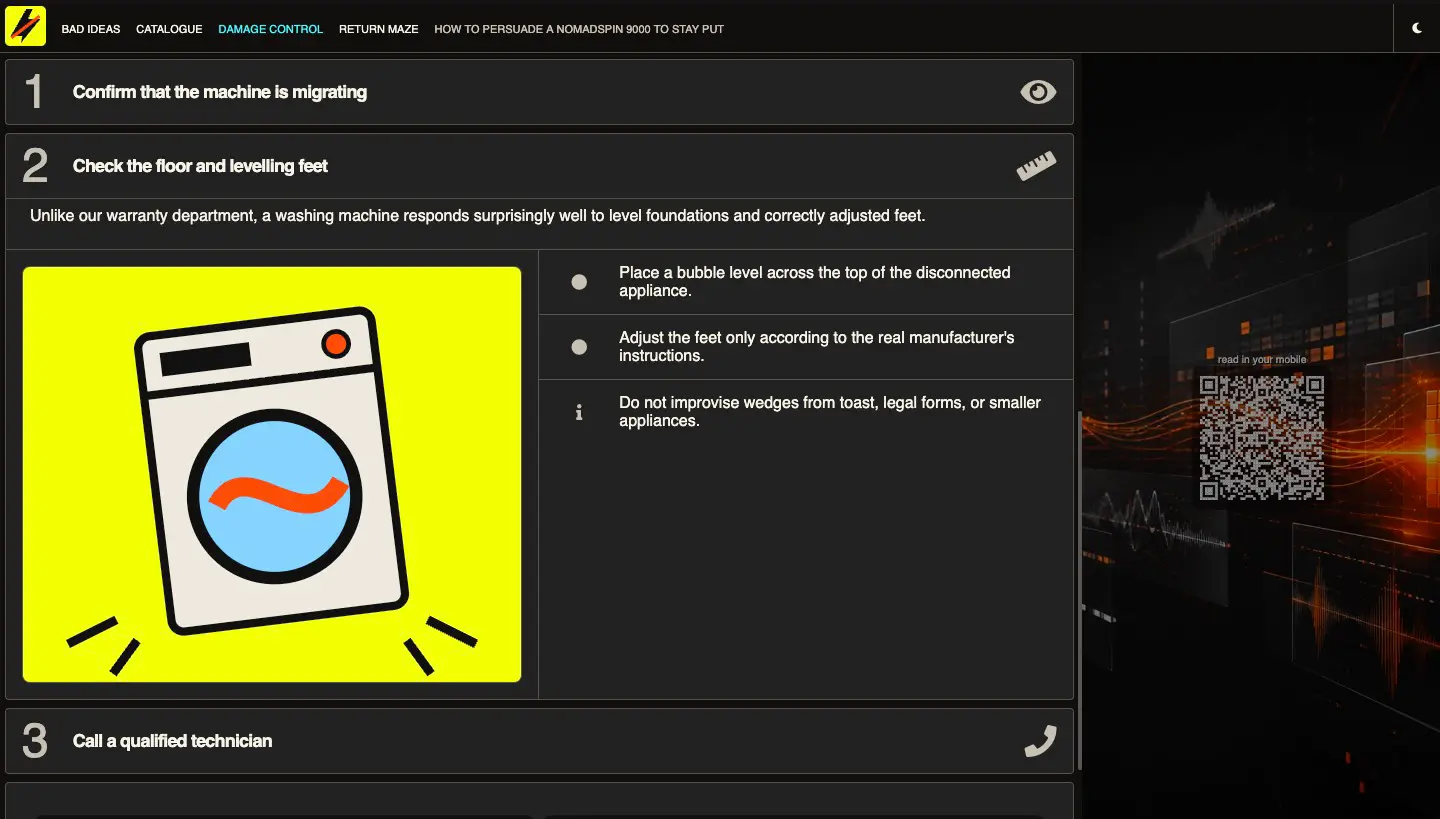
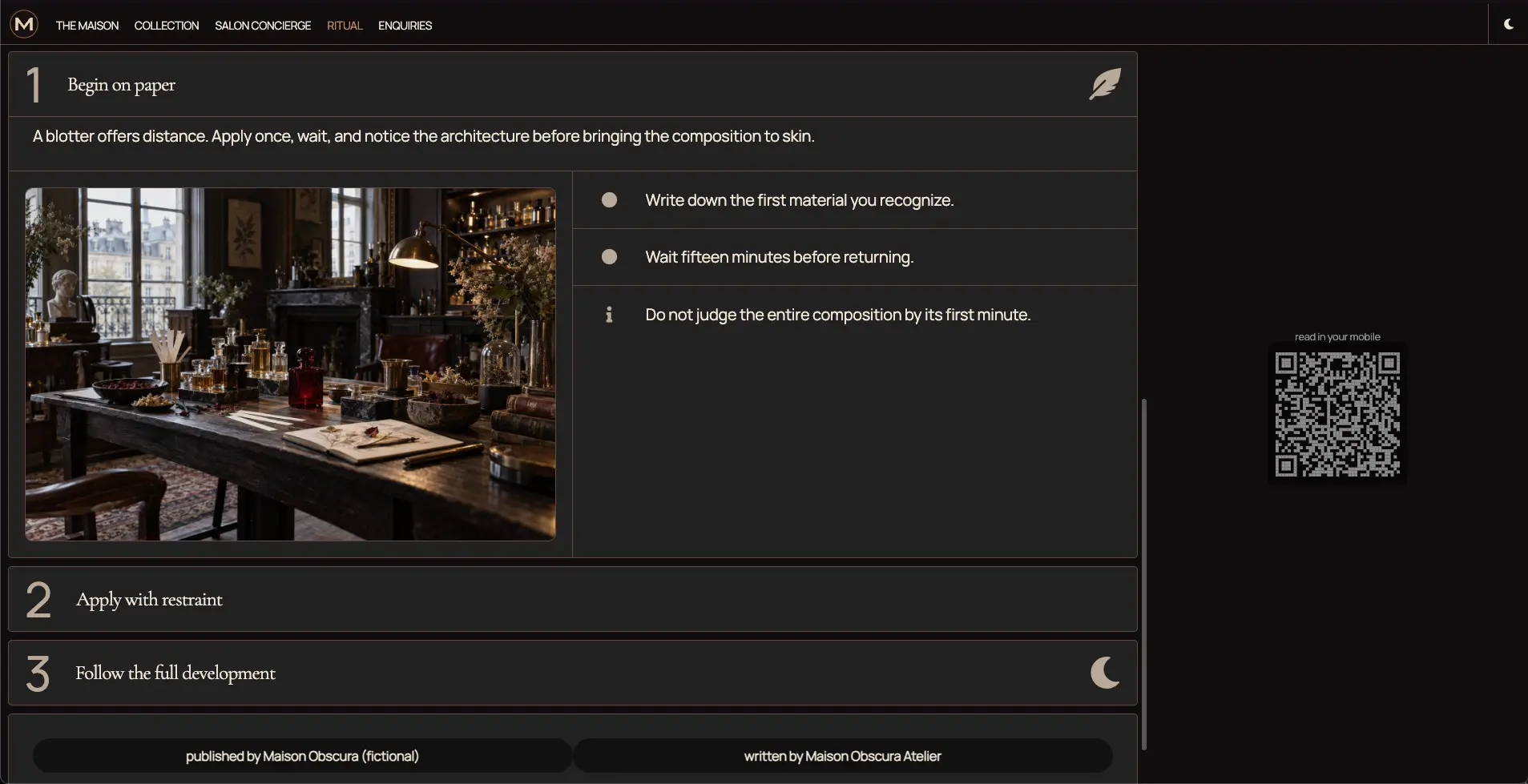
Example: howto.json
{
  "widget": "HowTo",
  "title": "How to prepare a bloody mary",
  "image": {"url": "res/howto/bloodymary.png", "alt": "bloody mary image"},
  "howto": {
    "image": {"url": "res/howto/bloodymary-2.png", "alt": "bloody mary image 2"},
    "youtube": {"ref": "VIDEO_ID", "image": "res/video-poster.webp", "title": "Descriptive video title", "class": ""},
    "supply": ["cocktail glass", "tomato", "cheap vodka"],
    "tool": ["tomato shredder", "manhattan mixer"],
    "estimatedCost": "1000€",
    "totalTime": "10 minutes",
    "author": "Cocktail Bob",
    "publisher": "Studio 54",
    "step": [
      {
        "title": "hover title",
        "icon": "star",
        "name": "Pick some tomatoes",
        "description": "Use red ones, green ones are too bitter",
        "image": {"url": "res/step1.png", "alt": "tomato picking image"},
        "itemListElement": [
          "Go to the tomato storage",
          "Open the door",
          "Pick 5 tomatoes",
          "Close the door"
        ]
      },
      {
        "name": "Smash'em",
        "text": "Smash'em with your shredder, be careful with your fingers, so cocktail is not literally bloody"
      },
      {
        "name": "Serve",
        "text": "Serve chilled"
      }
    ]
  }
}
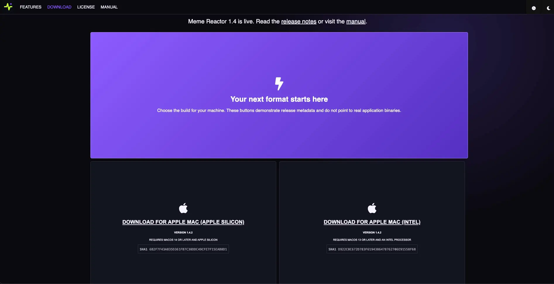
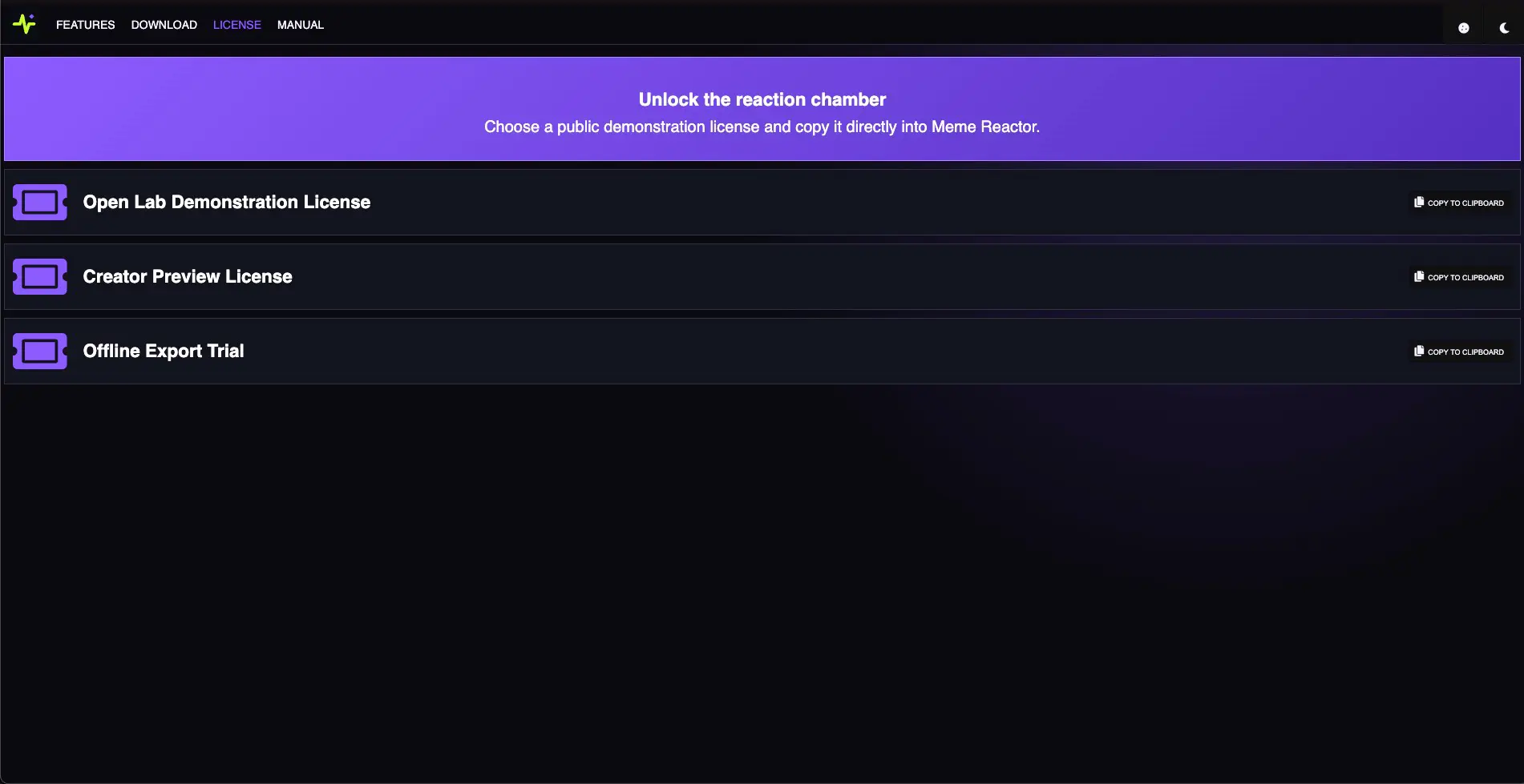
Creating pages for software download
Statify provides pages with ad-hoc functionality for sites about a downloadable application:
- Page to download the application for different platform
- Page to copy public licenses to activate an application
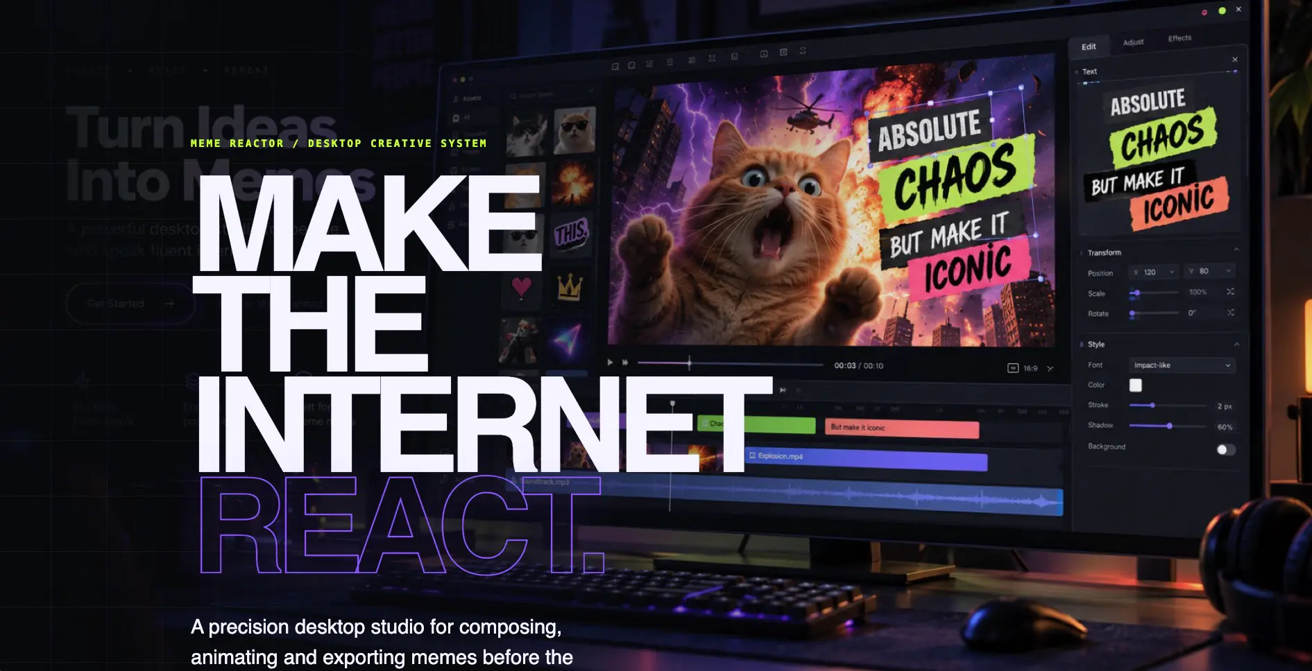
Quick Start
Just create a site with the application template
statify init my-application-site application
cd my-application-site
npm start
Shared attributes
The page definitions share two attributes:
downloadsUrl: the relative or absolute root under which downloadable files and metadata are published. Prefer a relative URL for files deployed with the site.fileKey: the application identifier and directory name. Use the same value on the Download and License pages for one application.
Together they resolve these resources:
<downloadsUrl>/<fileKey>/version.json
<downloadsUrl>/<fileKey>/licenses.json
<downloadsUrl>/<fileKey>/<fileKey>-<version>-<platform-suffix>
The built-in Download widget currently recognizes these exact platform keys and filename suffixes:
| Platform key | Label | Filename suffix |
|---|---|---|
osx-arm64 |
Apple Mac (Apple Silicon) | osx-arm64.dmg |
osx-x64 |
Apple Mac (Intel) | osx-x64.dmg |
win-x64 |
Windows | win-x64-Setup.exe |
Download page
You can create several Download pages if your site distributes several applications. The widget loads version.json, renders the supported platform cards, and constructs each binary filename from fileKey, the version fields, and the platform suffix above.
{
  "title": "Download",
  "description": "Download Absurd Application today",
  "widget": "Client",
  "generateH1": true,
  "class": "bg-window",
  "client": {
    "widget": "Download",
    "attrs": {
      "productName": "Absurd Application",
      "downloadsUrl": "/downloads",
      "fileKey": "absurd-application",
      "mobile": false,
      "releaseNotes": "Check out the <a href='/docs/release-notes.html'>Release Notes</a> and the <a href='/docs/faq.html'>FAQ</a>",
      "msgNotAvailable": "Download is not available for this platform",
      "notice": {
        "class": "betanotice",
        "icon": "robot",
        "title": "Absurd Application is in ALPHA",
        "text": "Please bear with us, it can wipe your hard disk"
      }
    }
  },
  "snippet": {
    "@context": "https://schema.org",
    "@type": "SoftwareApplication",
    "name": "Absurd Application",
    "operatingSystem": "Windows 10, OSX 10.14",
    "applicationCategory": "UtilitiesApplication",
    "review": {
      "@type": "Review",
      "reviewRating": {
        "@type": "Rating",
        "ratingValue": "5"
      },
      "author": {
        "@type": "Person",
        "name": "Jane Doe"
      },
      "reviewBody": "Absurd Application Changed my life"
    },
    "offers": {
      "@type": "Offer",
      "price": "0"
    }
  }
}
Download attributes:
productName: used in download status and error messages; defaults to the site name.downloadsUrl: defaults to/downloads. Leading-slash paths resolve from the Statify site root in normal and portable builds.fileKey: required application identifier used in metadata and binary URLs.mobile: set totrueto allow the download cards on detected mobile devices. When false or omitted, mobile visitors seemsgNotAvailableinstead.releaseNotes: optional trusted HTML displayed above the download cards. Keep its links relative when they point inside the site.msgNotAvailable: optional message shown when downloads are unavailable for the visitor's device.notice: optional introductory card withclass,icon,title, andtext.
The widget also accepts an update-check query in the form ?v=<version>-<platform>-<architecture>, for example ?v=0.24.3-osx-arm64. Without this query it shows the download cards described by version.json.
License page
The License widget uses the same downloadsUrl and fileKey to load <downloadsUrl>/<fileKey>/licenses.json. It renders one row per license and provides the copy-to-clipboard interaction; a custom script is not required.
{
  "title": "Licenses",
  "description": "Please pick the latest available license",
  "widget": "Client",
  "class": "bg-window",
  "generateH1": true,
  "client": {
    "widget": "License",
    "attrs": {
      "downloadsUrl": "/downloads",
      "fileKey": "absurd-application",
      "productName": "Absurd Application",
      "title": "Obtain an Absurd Application License",
      "subtitle": "We will publish monthly trial licenses so you can test Absurd Application without stress",
      "copied": "Copied to clipboard! Now paste into the application"
    }
  }
}
License attributes:
productName: required and used in status messages.downloadsUrl: defaults to/downloads.fileKey: required and normally identical to the Download page'sfileKey.title: optional heading above the license rows.subtitle: optional explanatory text beneath the heading.copied: optional notification displayed after a successful clipboard copy.class: optional class added to the introductory license card.itemClass: optional class added to each license row.
Download and license metadata
The widgets load their release and license data from these JSON files.
Dynamic Download metadata
The Download widget loads <downloadsUrl>/<fileKey>/version.json. It is an object keyed by a supported platform identifier. Each value contains integer major, minor, and revision fields plus optional sha and comment strings.
{
  "osx-arm64": {
    "major": 0,
    "minor": 24,
    "revision": 4,
    "sha": "db3ccb90a2887c7b8b22ed8fb2b9f2f13b379ef5",
    "comment": "Requires an Apple Silicon Processor"
  },
  "osx-x64": {
    "major": 0,
    "minor": 23,
    "revision": 3,
    "sha": "7684b68115922649c785a295a0a143f846758fd4",
    "comment": "Requires a Mac with Intel Processor"
  },
  "win-x64": {
    "major": 0,
    "minor": 22,
    "revision": 5,
    "comment": "For Windows 10 and 11",
    "sha": "898a53805a8a894244bfa411807b3e4ef29cb242"
  }
}
Dynamic License metadata
The License widget loads <downloadsUrl>/<fileKey>/licenses.json. It contains an array of objects with a visible title and the lic value copied to the clipboard. A license may be a JWT, but the widget treats it as an opaque string.
This JSON is publicly retrievable by every visitor. Include only licenses intended for public distribution, such as public trial or beta licenses. Do not publish private customer licenses or secrets here.
[
  {
    "title": "Permanent License",
    "lic": "eyJ0eXAiOiJKV1QiLCJhbGciOiJSUzI1NiIsImtpZCI6ImRlZm"
  },
  {
    "title": "2025 Beta License",
    "lic": "eyJ0eXAiOiJKV1QiLCJhbGciOiJSUzI1NiIsImtpZCI6ImRlZm"
  }
]
Other page types
Read Statify Extensions for details on other page types available via extansions.
- 3D Models: Display 3D models (GLB) directly on
FeatureListor as intependent pages.
Customizing the local stylesheet
Statify pages load a compiled application stylesheet, normally
app/website.css, containing the shared layout, widgets, and skin behavior.
Do not edit it during normal site authoring because replacing the application
stub overwrites it.
Put site-specific branding in a custom stylesheet, copy it with the other
resources, and include it from metadata.json.
assets/res/custom.css
Statify's shared skin is driven by CSS variables. Use :root for values shared
by both modes, .skinroot.light for light-only overrides, and
.skinroot.dark for dark-only overrides.
Minimal accent configuration
Most sites can begin by changing only the accent variables:
:root {
    --accent: #ff8800;
    --accent-tx: rgba(255, 136, 0, 0.5);
}
--accent-tx should be a translucent version or visual companion of the main
accent. Check buttons, links, focus states, and text placed over the accent in
both skins.
When the same accent does not provide enough contrast in both modes, scope it:
.skinroot.light {
    --accent: #b74d00;
    --accent-light: #fff1e6;
    --text-over-accent: #ffffff;
    --text-over-accent-hover: #ffffff;
}

.skinroot.dark {
    --accent: #ff9d3d;
    --text-over-accent: #111111;
    --text-over-accent-hover: #000000;
}
Advanced variable reference
Most sites need only the accent configuration above. The following variables are available for deeper skin customization. Surface, typography, and control size changes affect multiple widgets, so test both skins and all responsive layouts after overriding them.
Core surfaces and text
| Variable | Role |
|---|---|
--window-background |
Main application background |
--window-background-0 |
Lowest dark-skin surface step |
--window-background-1 |
First raised dark-skin surface step |
--window-background-2 |
Second raised dark-skin surface step |
--window-background-3 |
Third raised dark-skin surface step |
--window-background-hi |
Highlighted or raised surface |
--window-background-lo |
Recessed light-skin surface |
--text |
Main text color |
--text-lo |
Secondary or subdued text |
--border-color |
Borders and separators |
--placeholder |
Placeholder or empty-state surface |
--inputs |
Input background |
--shadow-color |
Shadow color |
--text must remain readable over every configured surface. The helper
classes .back-zero, .back-one, .back-two, and .back-three apply their
corresponding surface levels directly.
Accents and foregrounds
| Variable | Role |
|---|---|
--accent |
Primary brand and action color |
--accent-tx |
Translucent or softer decorative accent |
--accent-light |
Pale accent surface, especially in light mode |
--accent-alt |
Alternate accent |
--text-over-accent |
Text placed over the main accent |
--text-over-accent-hover |
Hover text over the main accent |
Pair --accent with readable --text-over-accent and
--text-over-accent-hover values for panels and buttons.
Statuses and overlays
| Variable | Role |
|---|---|
--back-success |
Success-message background |
--back-warning |
Warning-message background |
--back-error |
Error-message background |
--bg-ok |
Strong success indicator |
--bg-warning |
Strong warning indicator |
--bg-error |
Strong error indicator |
--alpha-band |
Translucent band or overlay |
--alpha-gradient |
Overlay or gradient endpoint |
--green |
Generic green utility color |
--orange |
Generic orange utility color |
--red |
Generic red utility color |
--black |
Stable black token |
These usually do not need site-specific overrides.
Responsive font sizes
| Variable | Default |
|---|---|
--font-xs |
16px |
--font-sm |
16px |
--font-md |
18px |
--font-lg |
18px |
--font-xl |
18px |
--font-fullhd |
18px |
Preserve readable mobile sizes and test long headings, navigation labels, tables, and code blocks after changing the type scale.
Control sizes
| Variable | Default | Role |
|---|---|---|
--unitsize |
3rem |
Standard control and navigation unit |
--unitsize-small |
2.54rem |
Compact control unit |
These are structural variables shared by controls, icons, and navigation. Change them cautiously.
Command reference
The template npm scripts described at the beginning of this guide are the preferred workflow. Use the CLI directly for custom destinations, focused builds, CI, or template maintenance:
| Command | Purpose |
|---|---|
statify init <destination> <template> |
Create a new source site. |
statify folder <source> [destination] |
Build an entire source folder. |
statify file <file> [destination] <source> |
Build one Markdown or JSON page. |
statify list <page-file> <source> [destination] [options] |
Publish static detail pages from list data. |
statify app <stub> <destination> |
Copy a compiled browser application stub. |
statify preview [directory] [port] [--open] |
Preview the generated site. |
statify skill install [--force] |
Install or replace the bundled Codex skill. |
The preview server binds to 127.0.0.1 and disables caching. It mounts normal
builds at the pathname from metadata.canonical and portable builds at /.
Stop it with Ctrl+C; provide a custom port positionally before --open.
Updating a project application stub
The template's npm run stub script is the usual way to refresh its selected
browser application. The equivalent low-level command is:
statify app simple assets/app/
Stub names are version-dependent. Run statify --help to see
those provided by the installed package.
Use a complete npm run build before publishing because it validates the rest
of the page tree and copies shared assets.
Focused page builds
Publish a single page while authoring with:
statify file pages/path/page.md .build .
statify file pages/path/page.json .build .
Deployment
The generated .build/ directory is an ordinary static website. Upload it to
a web server, object-storage bucket, CDN, static hosting platform, or another
application's public directory. Neither Statify nor Node.js is required in
production.
Before publishing a Statify site:
- parse every edited JSON file;
- keep one H1 and a meaningful heading hierarchy on documentation pages;
- confirm local image, stylesheet, script, font, video, and page references;
- provide meaningful alternative text for informative images;
- preserve accurate attribution and licensing information;
- replace template companies, URLs, people, policies, dates, and contacts;
- do not invent licenses, customers, testimonials, compliance claims, or analytics identifiers;
- run the complete npm build, including list-publication scripts;
- inspect representative generated HTML for its title, navigation, and content; for normal builds, also inspect canonical and structured metadata;
- preview the home page and a secondary page at desktop and narrow widths;
- test both light and dark skins when the theme control is enabled;
- confirm that the theme preference survives a reload.
Prefer the simplest supported structure that communicates the content well. The rich template is a syntax catalogue, not a target page length.